Ultimate Guide to Improving your Registration Rate

Having a significant increase in your online registration is one factor that you need to check if your brand is doing good in marketing. You would also want to know if you are doing the job properly in promoting your company’s services as well as winning a new customer.
With that, organizations or companies thrive on getting in touch with their prospective clients or consumers by using platforms like websites and social media to ensure success rate and how they can improve it.
Whether you are advertising an event, newsletters, product, or any program, it is essential to produce a website wherein you can showcase your company’s integrity, punctuality, and purpose at the same time. In addition, you will have to let them know what you could do to make their life easier.
Moreover, to be able to deliver, you must know the basics and consider creating an effective registration process for your prospective customer using a nicely done website.
So, what are the things they will need to see on your website, and will it be easier for them to sign up at the comfort of their home?
You must also know how to create an attractive registration page with all the information needed and the fields to gain enough data. We at GlockApps prepared an ultimate guide on how you can easily increase your registration rate and direct your customer to the right pages and build trust.
Website Creation
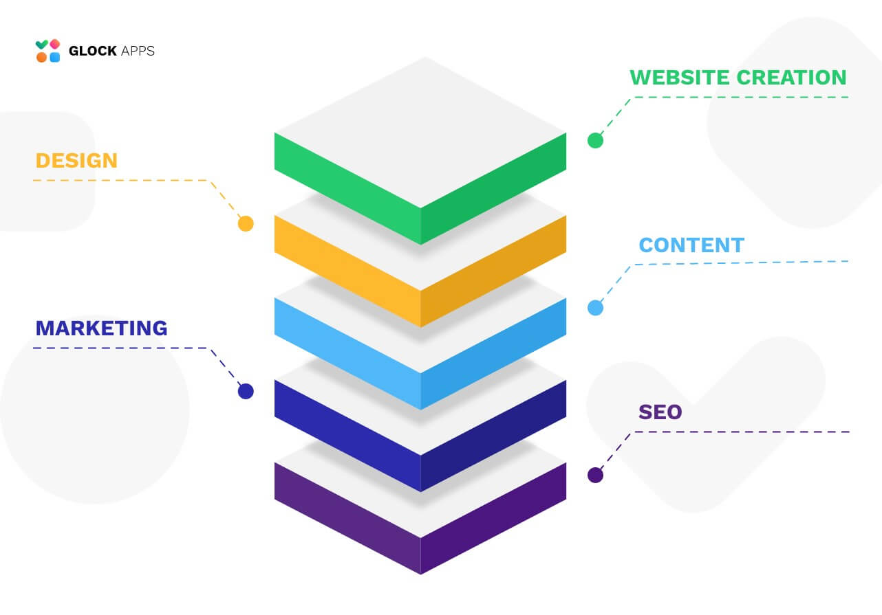
It is imperative to consider your brand reputation whenever you create a website; there are many factors you need to manage and it will begin with designing a website for your brand.
Know that it is not always about technical matters – it is also about how you can deliver a clear message to your audience. It should have the elements needed that will truly make it public and be known. Exploring the best website builders can help businesses achieve this balance, offering tools that combine professional design, ease of use, and features that strengthen brand presence online.
Read also: 4 Reasons to Start Website Uptime Monitoring Right Now
Remember that design is crucial, and so is the registration process. So it would be best if you were aligned with every aspect and goal of your company. That being said, a definite process such as the registration stage should be appropriately calibrated.
Sign up/Registration Processes
1. The Registration Link
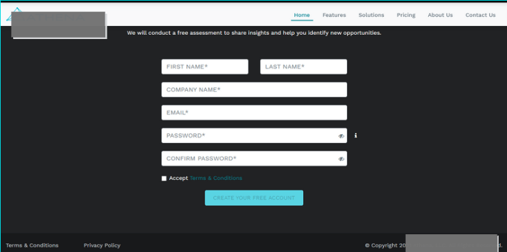
A set of fields that the prospective customer will use to input the customer’s information to create an account
for a particular service or product. I.e., subscription, plans, or programs they are offering.
Where is it located then?
Header: Most of the companies landing page place their link on the header, we could say 5% of them use Header to propose their services. You could also see them with a discount or promotions with it.
Personal Space: People usually navigate to this page more often; that is why almost 45 % of the companies use this page to place the registration link. It was observed that most of the stable or big companies do this trick and build their brand even more.
Body: It is usually utilized by 5% of the industries to place the registration link to gain more customers. You could have it combined with your ongoing incentive for getting your services. This part of your landing page also has the details of the services that they will get along with the registration link.
Footer: It is a standard format for most websites these days. They have their registration link placed on the footer to propose the account creation. (30 % )
Pop-Ups: Some (2%) also utilize pop-ups to suggest subscribing to a certain service or newsletter with a link leading them to the registration page. It is better if you could create segmentation to collect more data.
2. The Incentives
Another functioning tactic for a website to gain more traffic and successful registration is to have an incentive when they decide to subscribe or create an account with your company.
Remember that people would love to hear benefits that they can enjoy while getting your services. This is also an opportunity to explain the advantages of your program and how easy to get it using your registration link.
Come up with exciting games and a promo code to get a discount if they subscribe to your products and services as it will attract more customers. A considerable percentage of the company websites use this along with the pop-ups. Based on the study, this technique truly works.
More importantly, reiterate the benefits along with that promo code you are giving to your customers. It will not only help you increase the number of registration, but also entice them to generate more referrals in the future.
Be precise and clear. Make sure that you have a good program that will genuinely help them. Make it creative and attractive to your prospects. Utilize the segmentation to collect more information, personalized email addresses. This is also to help you gain more leads.
How Can You Improve the Registration Process?
Avoid Spam
We have to admit that it is part of our daily email. We can say that 7 out of 10 emails that you will receive in a day are just junk or spam. So, you must be aware of how to distinguish the difference between a legit one and prevent it from happening. To do so, have a significant process that will make sure people will receive the messages or confirmation you will send them. You don’t want them to miss important messages in the future.
To find out where your emails will land before actually sending them out we recommend using Inbox Email Tester. It will provide information on the folders your email will be delivered to with different mailbox providers, show if you are blacklisted, and provide information on your email authentication.
Fight Phishing Campaigns
Have detailed information about the things they should see from your company’s email and have confidence that they are in good hands. Let them know how they can identify if it is a legit email from your company. You should also take care of your email authentication to prove to mailbox providers you are a legitimate sender and protect your recipients from phishing attacks.
Read also: Email Authentication: the Ultimate Guide
Preference Center
Provide a good preference center to make your consumers be more confident about the product they are getting. Have some explanation of every situation they might experience and FAQs for them to better understand every aspect of your service.
Create content that will help them every step of the way. This will also have a positive impact on the customer experience and again generate more possible customers through referrals.
3. The Confirmation
Once done with their registration, people would want to receive their confirmation in the email. Ensure that they will not wait hours for this email.
Double Opt-In
Double opt-in is also called a confirmed opt-in, and it is a two-step subscription method where a person needs to confirm their willingness to receive your emails. It is observed that having a double opt-in is more effective in improving the registration rate, especially in European countries.
Welcome Message/Online Confirmation
Create an enticing welcome email to your beloved customers. Make an unforgettable impact when sending these to customers if you want them to have a good impression of your company.
Make it prompt; as soon as they finish registering for your newsletter, they must receive the welcome email. If possible, make it creative and personalized. You could also use these welcome emails to collect more data from your customer.
TAKE NOTE
Ensure regular testing and proper maintenance of your website to avoid missed campaigns received by your consumer.
Be proactive.
Keep GDPR in mind. Although we have mentioned the double opt-in preference, it should not be on default.
Lastly, you have to make sure that you have an unsubscribe button/option for your consumer. Not only for a better customer experience but to build a long-lasting relationship with trust with your customers.
To make sure your emails land in the inbox, run a free deliverability test today!
