Email Accessibility Best Practices
Table of Contents
Email accessibility has been a top trending topic for email marketers in 2022. As society shifts to promote diversity, equity, and inclusion, it’s become more important for email marketers to create accessible content that every subscriber can digest.
26% of the United States population has some sort of disability. Thus, there are many different kinds of conditions to consider when creating accessible emails. Even though your emails may not be able to accommodate everyone, follow these email accessibility guidelines to increase your email campaigns’ accessibility.
This article will highlight 9 email accessibility best practices to help your email messages appeal to your entire audience.
What is Email Accessibility
Email accessibility helps your email message become easier to consume for people with disabilities. Some changes are small, like adding alternative text to photos, but others should be applied to all your emails; for example, using larger fonts that are more legible on mobile devices.
It’s critical to include screen readers, font size, color coordination, and other best practices in your email marketing plan.
Why does Email Accessibility Matter?
A substantial amount of people have some sort of disability they live with. Studies show that over one billion people have an impairment, whether it be visual, auditory, or other.
Every email marketer should be conscious of this significant portion of their email clients. An accessible email is more inclusive and reduces the legal risk of triggering a life-threatening attack.
Conditions to Consider When Creating Accessible Emails:
- Visual Impairments
- Auditory Impairments
- Cognitive Impairments
- Neurological Impairments
- Physical Impairments
- Speech Impairments
Visual Impairments
The majority of people with impairments have some degree of visual disabilities. The World Health Organization states that there are over 2.2 billion people with vision impairment.
To accommodate visually impaired users, ensure your email message is compatible with screen readers and other assistive devices for blind subscribers. Your visual content should also have descriptive text to help those with vision loss.
Additionally, you should make sure that the colors in your email are contrasting and that the text uses large, legible fonts.
Auditory Impairments
People with auditory disabilities have difficulty hearing different volumes and frequencies of certain sounds. Other people constantly hear phantom noises.
To accommodate audibly impaired subscribers, add closed captions and transcriptions to all your videos.
Cognitive Impairments
Cognitive disabilities cause people to have difficulties with their memory, attention span, problem-solving, or comprehension.
Avoid using distracting visuals and technical language. Instead, use simple, clear instructions, and a basic presentation.
Neurological Impairments
People who have experienced strokes, epileptic seizures, dementia, Parkinson’s disease, multiple sclerosis, or brain tumors all face neurological impairments.
Because these diseases affect the central and peripheral nervous system, you need to make sure your email message is easy to navigate and does not contain flashing imagery that could trigger a seizure.
Physical Impairments
Physical impairments cause weakness or limitations with mobility. Paralysis, arthritis, missing limbs, and other physical disabilities make it difficult for some users to navigate an email with many components.
Make sure your email content is easily accessible with keyboard navigation tools, screen readers, and other assistive devices.
Speech Impairments
Stuttering, tongue-tie, and muteness are examples of speech impediments. Individuals who experience problems with their speech have difficulty articulating their thoughts.
Offer your subscribers multiple ways to get in contact. Aside from phone calls, allow your recipients to reply through email or through a messaging app.
Is your Email Accessible?
It is difficult for people to understand what it’s like living with a disability unless they have experienced it themselves. That’s why it’s important to do your research, become educated, and accommodate screen reader users and other assistive technology users.
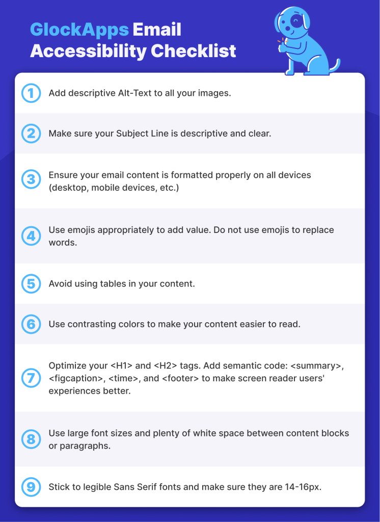
Make your email campaigns more friendly for your email clients with disabilities. Follow the GlockApps Email Accessibility Checklist:
Email Accessibility Checklist
- Add descriptive Alt-Text to all your images.
- Make sure your Subject Line is descriptive and clear.
- Ensure your email content is formatted properly on all devices (desktop, mobile devices, etc.)
- Use emojis appropriately to add value. Do not use emojis to replace words.
- Avoid using tables in your content.
- Use contrasting colors to make your content easier to read.
- Optimize your <H1> and <H2> tags. Add semantic code: <summary>, <figcaption>, <time>, and <footer> to make screen reader users’ experiences better.
- Use large font sizes and plenty of white space between content blocks or paragraphs.
- Stick to legible Sans Serif fonts and make sure they are 14-16px.
How to make Emails Accessible
There are many ways to make an email accessible for all your readers. Follow these 9 best practices to make your email program more ADA compliant.
- Alt Text
- Descriptive Subject Lines
- Responsive Design
- Appropriate Emoji Use
- Avoid Using Tables
- Color Selection
- Optimize your Code
- Text Line Height & Spacing
- Text Size and Fonts
Alt Text
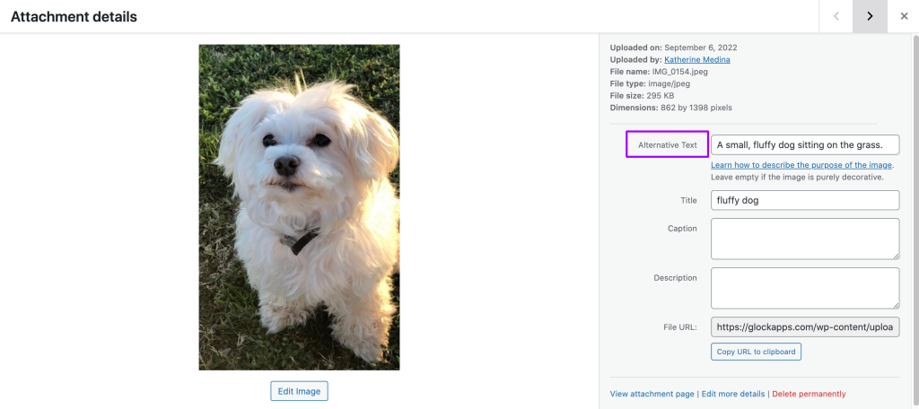
Alt text increases web accessibility for people with a vision impairment as a text alternative to images. An alt attribute should be a short description of the image’s meaning or its purpose.
First, you need to decide if the image is functional, illustrative, or decorative. All images require an Alt attribute, so an empty, or null alt attribute should be used for images that don’t need to be read by screen readers or do not represent anything vital to the subscriber.
For example, the alt attribute of this picture would say “A small, fluffy dog sitting on the grass.”
While drafting an accessible email, you have to keep in mind that recipients with vision loss may be using screen readers. A screen reader aids its user by reciting the contents on the screen out loud for the person to hear. Screen readers read text and describe images using alt text.
Some email clients block images when alt text is not present. So image-only emails are at risk of being blocked altogether due to the fact that screen readers can’t interpret the images without alt text.
Descriptive Subject Lines
It’s always important to be transparent with your email client. Subject lines are equally as important if not more important than the email content itself.
You have 41 characters to capture your recipient’s attention while being honest about what your reader should expect from your email.
Avoid click-bait subject lines, as they may upset your subscribers, resulting in spam complaints which can negatively impact your sending reputation and deliverability.
Responsive Design
More than 80% of the world’s population owns a smartphone. Since we function in a world consumed by mobile devices, website and email responsiveness is critical for success.
It’s difficult for a user to navigate a website that is not mobile responsive. If it doesn’t shift into a single-column layout when a person is using a mobile device, some elements can be difficult to read or interact with.
Always make sure your email marketing campaign is responsive by testing how it appears on mobile devices before your schedule its broadcast. If your emails are not optimized for all devices, screen readers may not display your content in the correct order.
Appropriate Emoji Use
Emojis add some fun to the otherwise, bland internet. They are a creative form of expression that should be used appropriately and sparingly in a work environment.
You should add emojis to your content if you believe it adds some sort of value. However, you should never substitute words for emojis.
Every emoji has a pre-defined meaning (its Unicode string) that can be interpreted in different ways.
Example 1: Sign of the Horns 🤘
Some people think of this emoji as a “rockstar” emoji, but its proper name is “sign of the horns.”
This hand gesture has different meanings in different cultures. In some countries, it is considered offensive while in others it’s associated with music and sports culture. It is also commonly mistaken for the 🤟 emoji which means “I love you” in sign language.
If you insert this emoji into your email content, screen reader users will hear their device say “sign of the horns” and may become confused or upset.
Example 2: Dizzy Symbol 💫
Many people believe that this emoji is a shooting star, but in fact, it’s actually called “dizzy symbol’ to signify the phenomenon of stars flying when someone bumps their head.
If you add this emoji to your emails with the intention of it being astral, some email clients with screen readers will hear “dizzy symbol” when the screen reader reads the emoji out loud.
Learn More about: Using Emojis in Email Marketing
Avoid Using Tables
Tables can be useful to help you organize information, but can sometimes be difficult to read. People who use a Magnifier tool may have trouble reading tables with a fixed width as it may not be responsive to mobile design. This can cause the text font to be too small to be legible.
If you have to use a table, please take the following precautions to ensure your content is as accessible as possible.
- Avoid using fixed-width tables
- Add table headings
- Make sure the table displays correctly on mobile and desktop devices
- If you have any links in your table, edit the link text so it makes sense and doesn’t break midsentence.
- Send yourself the email and make sure you don’t have to scroll horizontally to view the full table.
- Test your accessibility with the Immersive Reader (if you’re using Outlook to send the message)
Color Selection
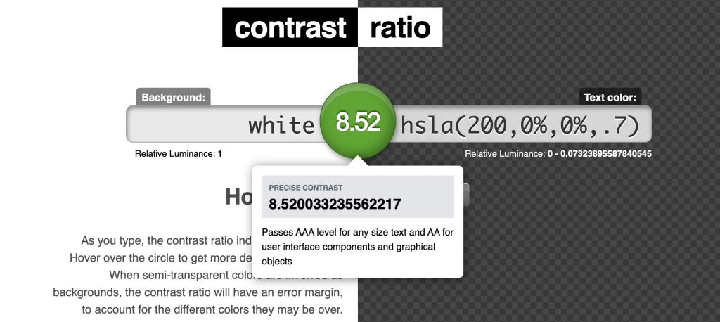
Color combinations are another factor to consider when creating an accessible email. You can’t rely on color to emphasize focal points. Some people live with color blindness and won’t be able to tell the difference without sufficient contrast.
A strong color contrast ratio improves your design’s visibility for individuals who have difficulty with differentiating colors. Make sure your font color and background colors have an appropriate color contrast so your text does not blend in with your background.
Use a color contrast tool to check if your contrast ratio meets global accessibility standards.
Color blindness can also affect the way people perceive link text. Hyperlinked text is mostly distinguished by its color contrast. If a person is colorblind, they might not be able to tell the difference between normal text and a link. Therefore, you should either bold or underline meaningful link text so there can be some distinguishing factor outside of just color contrast.
Optimize your Code
Certain HTML elements can also affect the quality of your accessible emails. Without a proper code configuration, a screen reader may not emphasize crucial information.
Use semantic elements such as <H1> and <H2> tags. By adding a content hierarchy, the screen will have a clear understanding of important elements in your copy. Also add semantic code such as <summary>, <figcaption>, <time>, and <footer> to make screen reader users’ experiences better. Remember to insert style=”margin:0;” into the opening semantic tags, which will then stop email and webmail clients from automatically increasing the space around the headline and subheadings.
Adding a language attribute to your code will also help screen readers pronounce or display your content properly. Otherwise, it may read your content with its default dialect which can be difficult to understand.
You can set your language attribute by using the first two letters of your language (en for English, fr for French, etc). Reference this full list of language codes.
What is ARIA?
Accessible Rich Internet Applications, or ARIA, was developed by the World Wide Web Consortium (an international standards organization) to improve the experience for screen reader users. It helps add descriptive information to HTML elements and bridge any gaps that can occur with ADA technology.
Text Line Height & Spacing
Reading long-form text without proper page breaks can be tiring for anyone, not just people with vision problems. If text is too close to each other (vertically or horizontally,) it can be difficult to read.
When drafting accessible emails, make sure your line height (the space in between lines of text) is primarily 1.5 px. Single-line text is harder to read.
Also, make sure there is plenty of space between each character. Letters that are too close together or too far apart make it difficult to read words at a glance.
Additionally, leave plenty of white space breaks between content blocks and paragraphs to increase focus and make it easier for your email client to read.
Text Size & Fonts
Font size is another important element to consider when creating accessible emails.
Standard-sized text increases your email accessibility. In order to make your content easier to read, we recommend that you use 14-16px font size, especially on mobile devices.
Besides font size, some fonts themselves are subjectively more difficult to read than others. We also recommend you primarily use legible fonts from the Sans Serif family such as:
- Arial
- Futura
- Optima
- Trebuchet
- Frutiger
- Helvetica
- Tahoma
- Univers
Accessibility Testing Tools
There are different ways you can test your email’s accessibility.
Test Color Contrast
Some people find it hard to read content where the text and background colors are similar.
Use Contrast-ratio.com to check your color’s contrast ratio and see if it passes AA and AAA requirements.
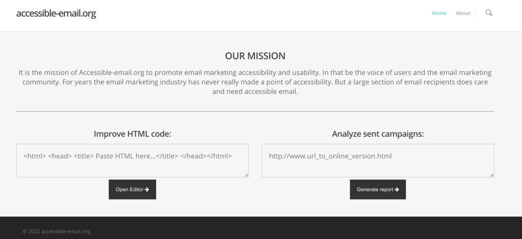
Test HTML Code
Make sure your email’s HTML code is optimized for screen readers.
Use a tool such as Accessible-email.org to improve your HTML code to be more accessible.
Test Accessibility
Microsoft tools such as Word and PowerPoint allow you to test your content’s accessibility.
Microsoft’s Accessibility Checker
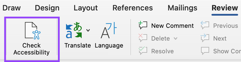
- On the Microsoft Office app, go in the Review tab that’s located in the toolbar. In Outlook, you’ll only see the Review when you are replying to or sending a message.
- Click Check Accessibility and apply any recommendations.
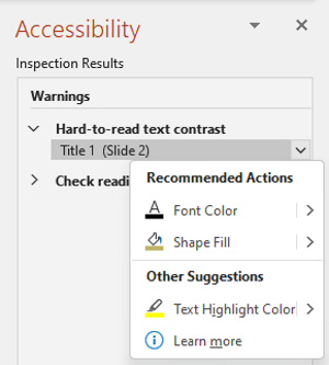
- To fix any accessibility issues with your content, reference the Accessibility pane and resolve any issues under the Warnings or Errors tab. Click the down-facing arrow next to an issue to choose quick a resolution.
Immersive Reader
For Outlook users, you can even test your email’s accessibility by using the Immersive Reader.
How to use Immersive Reader:
- In your message, select Message > Immersive Reader.
- On the Immersive Reader tab, select Read Aloud.
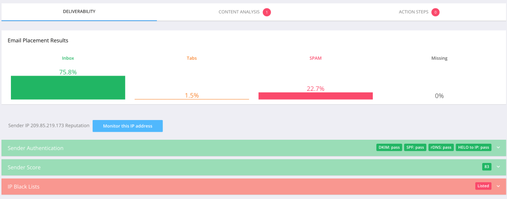
Test Email Deliverability
Email accessibility is only beneficial for the people who actually receive your emails. Even if you optimize your emails to be more accessible, your recipients still need access to your emails. They can’t access your emails if they’re lost in the spam folder or not delivered at all.
Ensure your emails reach your recipient’s inboxes by testing your email deliverability.
Mailbox Provider Accessibility
If you feel that accessible emails could be beneficial to you, here are a few ways that the top 4 email service providers (Gmail, Outlook, Yahoo! Mail, and IOS Mail) can help improve your experience maneuvering emails.
Gmail Accessibility
Google has influenced the development of many Accessibility tools including:
- Live Transcribe: An android app used to help capture speech and sound and see it as text on your screen
- Lookout: An android app that uses computer vision to help people with vision loss in gaining information about their surroundings
- Sound Amplifier: An android app that utilizes wired or Bluetooth headphones to filter, augment, and amplify the sounds in your environment or on your Android device
- Voice Access: An android app that lets you open apps, navigate, and edit text with spoken commands.
Outlook Accessibility
On Outlook, you can request for a sender to send you only accessible content.
- To view your account details on the web, in Outlook, select File > Info.
- In Account Settings, click the link under Access this account on the web. Outlook on the web opens in your browser.
- In Outlook on the web, to go to Accessibility Settings, select the gear symbol > View all Outlook settings > General > Accessibility.
- Select the Ask senders to send content that’s accessible checkbox to request accessible content.
Yahoo! Mail Accessibility
Yahoo! Mail developed the Accessibility lab where they’ve created amazing tools for the disabled community such as:
- a braille display
- alternative switches
- foot pedal
- bone conduction headphones
- a large yellow trackball
IOS Mail Accessibility
Apple takes Accessibility measures very seriously. They’ve developed features for people living with the following impairments:
How to Enable Accessibility Features on IOS
On an iPhone with Face ID, you can turn accessibility features on or off by triple-clicking the side button. You can also set up an Accessibility Shortcut: Go to Settings > Accessibility > Accessibility Shortcut, then select which features you use the most.
Conclusion
Web accessibility will only become increasingly more prevalent as we shift to a more inclusive and diverse society.
Digital marketing professionals have to prioritize creating accessible emails for all their recipients to consume.
These changes to your marketing strategy can be as simple as adding alt-text to your images, but it would mean the world of a difference for someone using a screen reader.
Make this your go-to document to avoid accessibility issues with your future email campaigns.
Good luck on your email marketing journey to a more accessible future!
Related Posts

It’s no secret that email authentication isn’t optional anymore. With mailbox providers like Google and Yahoo tightening sender requirements, companies Read more
Deliverability rules from providers like Google and Microsoft have made mailbox management a critical part of any outreach strategy. If Read more
If your email campaigns suddenly start underperforming, there’s a strong chance spam traps are involved. From my experience in email Read more

For 59% of marketers, email is the top channel for revenue generation. This year, the stakes are getting even higher Read more