The Importance of Fonts in Email Marketing
Estimated reading time: 7 minutes
Email marketing is an important growth channel for any business to reach its audience. The design of your emails has a significant impact on your results. Fonts are one of the most important design elements that can help you improve the readability of your emails, strengthen your brand identity, and guide reader’s attention to critical parts of your message, ultimately driving conversions.
Understanding the Types of Fonts
Serif Fonts
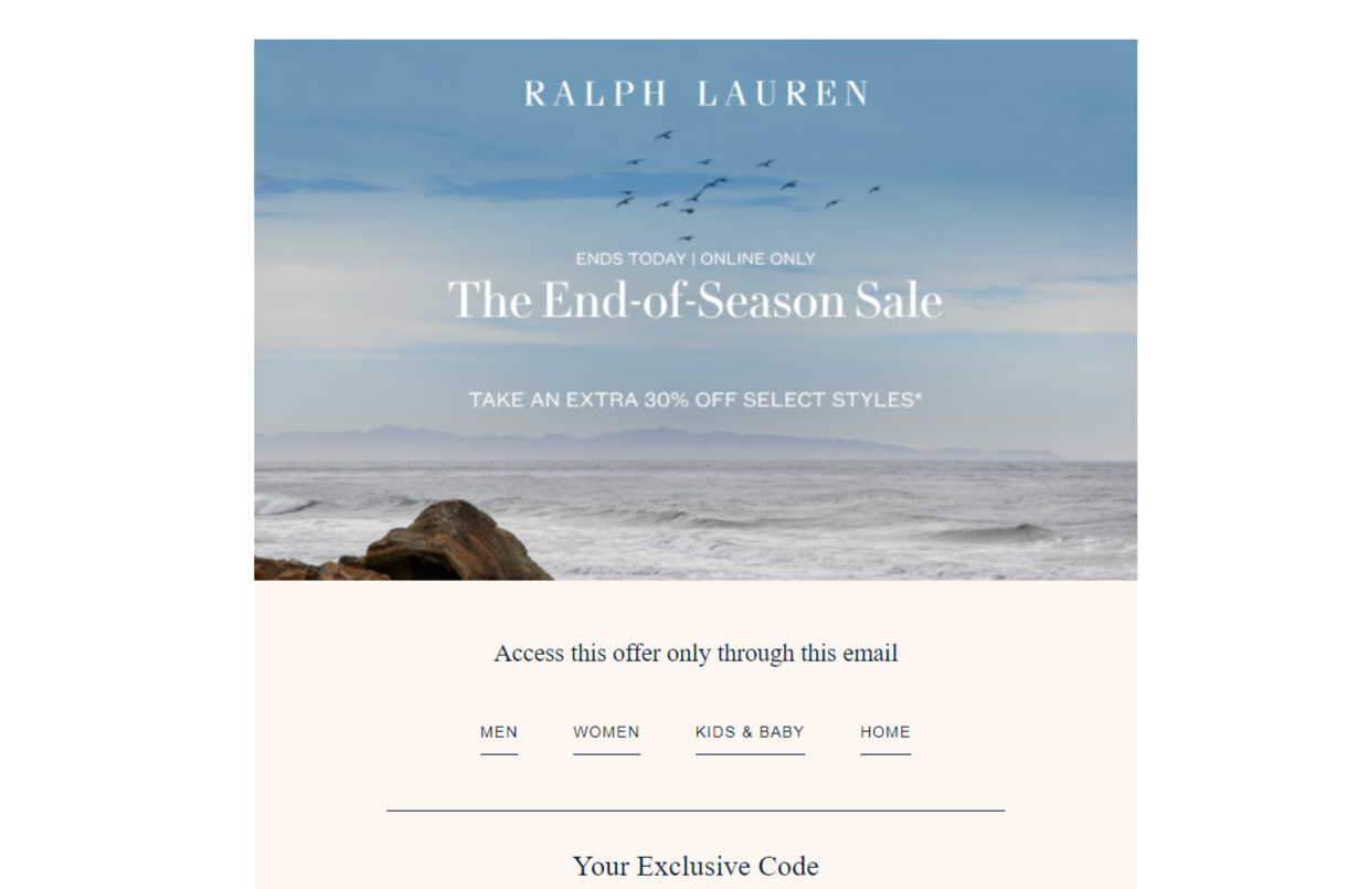
Serif fonts, like Times New Roman and Georgia, are characterized by small lines or strokes attached to the ends of letters. These fonts convey a sense of tradition, authority, and professionalism. It makes them a great choice for formal or rather serious content. For instance, financial institutions or academic newsletters might benefit from the trust and gravitas these fonts bring along.
Sans Serif Fonts
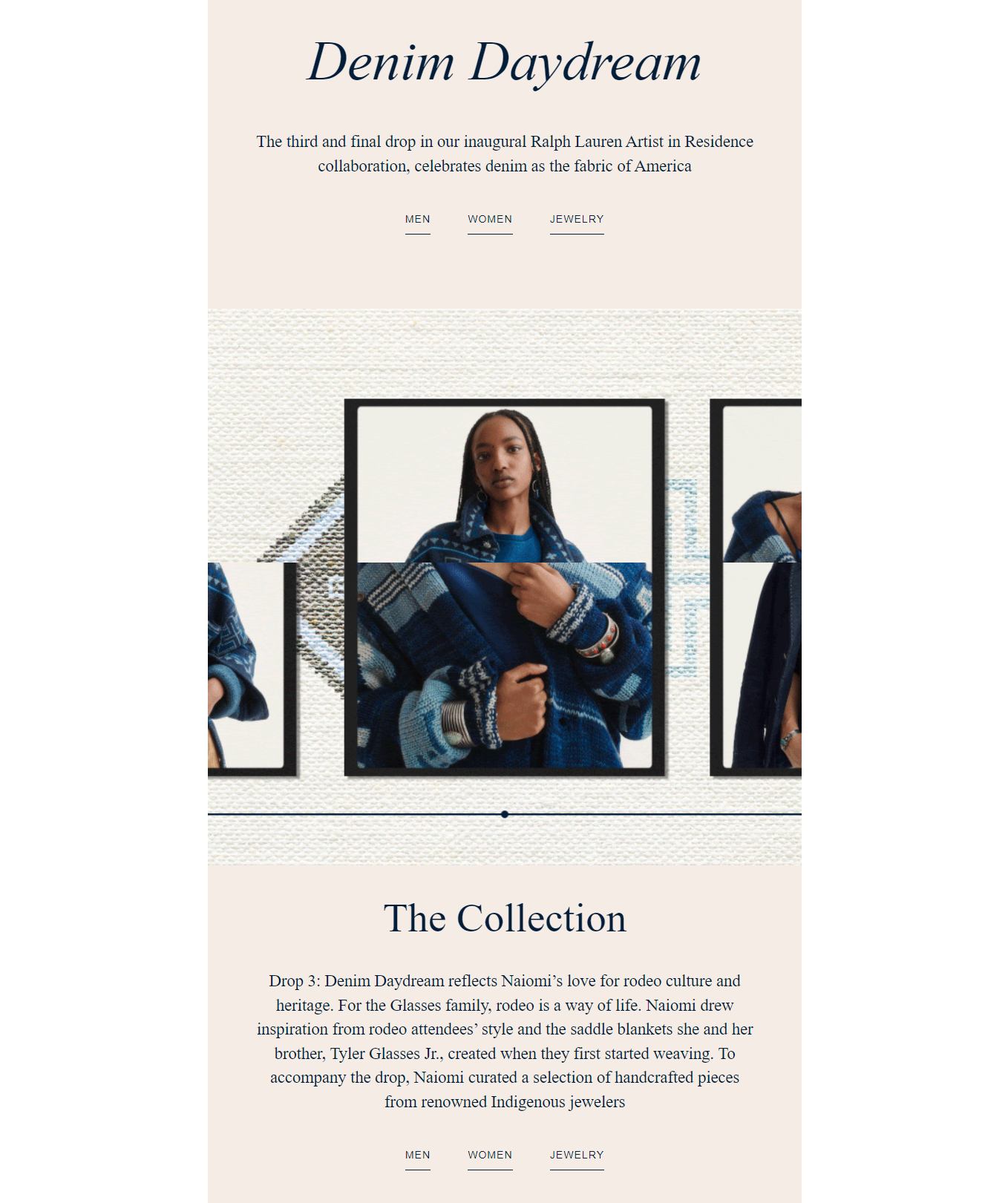
Sans serif fonts, such as Arial and Helvetica, are clean and modern. They lack the decorative strokes of serif fonts, which makes them easier to read on screens. These fonts are versatile and widely used across various industries, from tech startups to fashion brands, due to their clarity and contemporary feel.

Cursive and Fantasy Fonts
Cursive and fantasy fonts are more decorative and are often used to inject personality and creativity into an email. However, they should be used sparingly and strategically, perhaps in a logo or a headline, to avoid overwhelming the reader or detracting from the main message.

Monospace Fonts
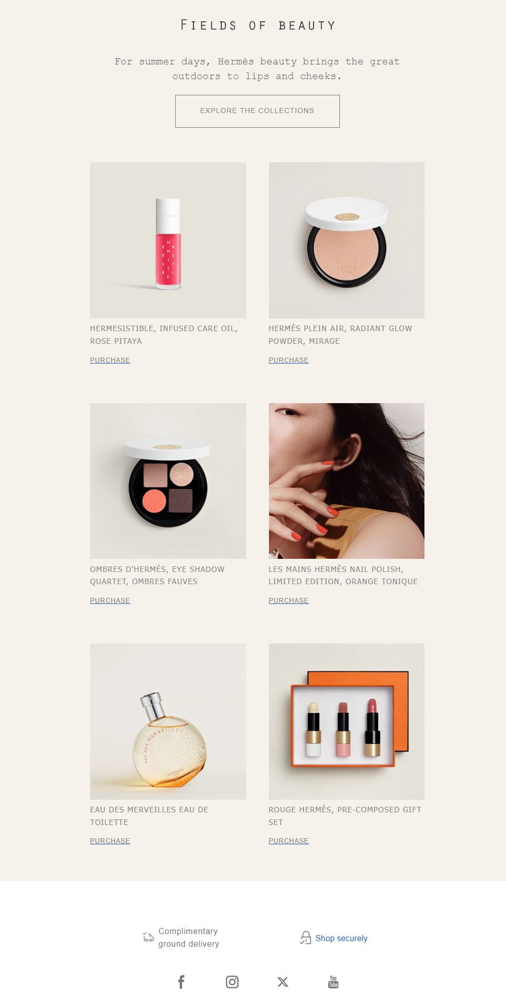
Monospace fonts, where each character occupies the same amount of space, can give your emails a retro, typewriter-like appearance. They are often used in coding or tech-related communications to distinguish code snippets from the rest of the text.
Why Does Font Selection Matter?
1. Reinforcing Brand Identity.
It is important to ensure that you stay consistent with the fonts you are using across all channels that you communicate through. For instance, if your brand uses a particular font for its website or for its product packaging, then also using the same or complementary font within your emails can help create a greater sense of brand recognition and trust with your audience.
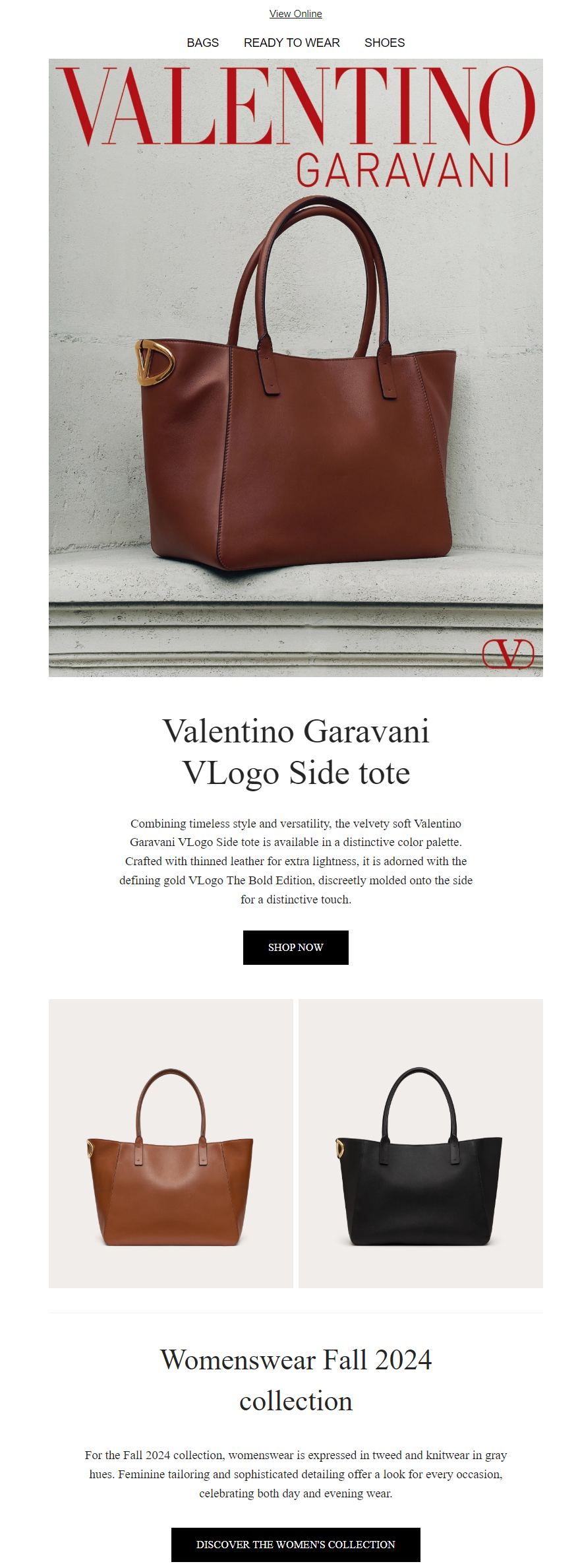
2. Enhancing Readability.
The main purpose of any email is to communicate information. If your font choice makes the content difficult to read, your message will be lost and the email will probably be quickly deleted. For body text, use fonts that are easy to read on all devices, particularly mobile devices. Remember, a significant portion of emails are now opened on mobile devices, so readability is very important.
3. Driving Conversions.
Fonts can surely influence the way readers interact with your email content. Strategic use of bold, italics and different font sizes can draw attention to key elements like calls to action (CTAs). For instance, a large, bolded font in a contrasting color can make your CTA stand out, prompting the reader to take the desired action, whether it’s making a purchase, signing up for a webinar, or downloading a resource.

Best Practices for Font Usage in Email Marketing
Font Pairing: Combining two complementary fonts can add visual interest and hierarchy to your emails. A common practice is to use one font for headlines and another for body text. For example, pairing a serif font with a sans serif font can create a pleasing contrast that guides the reader through the content more smoothly.

Testing Across Devices: Not all email clients render fonts the same way. Always test your emails on various devices and email clients to ensure that your chosen fonts display correctly. Try our HTML checker to make sure your emails are flawless every time.
Custom Fonts: For brands looking to stand out, custom fonts can offer a unique touch that sets your emails apart from the competition. However, implementing custom fonts requires technical expertise and thorough testing.
Also, try to avoid:
Overuse of Decorative Fonts: While it’s tempting to use fancy fonts to make your email stand out, overdoing it can have the opposite effect. Stick to decorative fonts for headlines or small sections of text, and always ensure they align with your brand’s tone.
Overcrowding with Text: No matter how great your font choices are, overcrowding your email with text will overwhelm your readers. Maintain a balance between text and white space to allow the content to breathe.
Conclusion
Choosing the right font is something that goes beyond design. It’s a strategic decision that can impact how people perceive your message, your brand, and even whether your emails get opened or clicked. Understanding how you can use fonts, test your choices, and tie them all together with your brand and audience, will help to take your email marketing to the next level, and ensure your campaigns not only look great but perform well too.
Choosing the right font is surely crucial, but ensuring that your emails are delivered and opened is even more important. Test your deliverability to make sure your carefully crafted messages reach your audience effectively.
FAQ
Fonts impact readability, the way your brand is perceived, and conversion rates. The right font can make your email more engaging and effective.
Serif fonts, like Times New Roman, have small lines at the ends of letters. They convey professionalism and are ideal for more formal content and classy aesthetics.
Limit your email to one or two complementary fonts to maintain a clean, professional appearance and avoid overwhelming your readers.
Custom fonts can make your emails stand out but require testing to ensure they display correctly across all devices and clients.


