Responsive Email Design Best Practices You Should Know

Estimated reading time: 5 minutes
If your message looks cramped on a phone, buttons are hard to tap, or columns break in Gmail, customers notice. A responsive email adapts seamlessly to different devices, creating a user-friendly experience whether someone opens it on a laptop, tablet, or smartphone. The ability to deliver a message that looks perfect everywhere is directly tied to customer satisfaction, engagement, and long-term loyalty. In this article, we’ll explore what responsive email is, why it matters, and the best practices to follow.
What is Responsive Email?
A responsive email is an email that adjusts its layout and design automatically based on the screen size and device being used. Unlike fixed-width designs that often break on smaller screens, a responsive email template uses responsive design techniques such as fluid grids, flexible images, and email media queries to ensure readability and functionality.
For example:
- On a desktop, you might see a two-column product showcase.
- On mobile, that same layout transforms into a single column for easier scrolling.
This adaptability ensures email responsiveness, eliminating the frustration of tiny fonts, broken layouts, or CTAs too small to tap.
Why Responsive Email Matters for Customer Experience
1. Mobile-First Habits.
Customers today live on their phones. If your campaign isn’t optimized with a mobile responsive email template, users may delete it before even attempting to read.
2. Improved Engagement and Clicks.
A clean, email responsive design encourages subscribers to scroll, interact, and click through, boosting your CTR and conversions.
3. Reduced Abandonment.
Broken layouts or unreadable text can frustrate users. Responsive design email prevents churn by keeping the experience smooth.
4. Accessible and Inclusive.
Everyone, regardless of device or accessibility needs, can consume your content.
5. Stronger Branding.
Consistency is key in responsive marketing. A polished look across devices builds trust and reinforces your brand identity.
Responsive Email Design Best Practices
Designing responsive emails requires more than resizing content. Here are the best strategies to follow:
1. Mobile-First Email Design.
Always design with smaller screens in mind before scaling up. This guarantees a flawless mobile email design experience.
2. Use Email Media Queries.
With email media queries, you can change fonts, layouts, and image sizes based on screen width. They are essential for a responsive email framework.
3. Simplify Layouts.
Stick to single-column structures for mobile responsive emails. Multi-column designs often break on smaller devices.
4. Readable Typography.
- 14-16px minimum body text.
- 22px+ headlines.
5. Optimized CTAs.
Buttons should be thumb-friendly (44x44px minimum) and clearly visible in an email.
6. Flexible Images.
Use lightweight, scalable images with alt text. Test for HTML email responsive performance.
7. Cross-Device Testing.
Before sending, test your responsive email designs on multiple devices and clients (Gmail, Outlook, Apple Mail, etc.).
8. Email Deliverability Check Up.
Before fixing any problems regarding the design, we recommend checking the essential email deliverability. Do your emails end up in spam? Why does it happen? Find out with GlockApps. Test your email deliverability and get recommendations to solve any issues.
Challenges of Responsive Email Design
Even with best practices, creating responsive emails can be tricky. Common challenges include:
- Inconsistent Rendering: Different email clients interpret code differently.
- Complex Development: Adding responsive design techniques often requires experienced coders.
- Load Times: Heavy images can slow down mobile performance.
- Limited Support for Media Queries: Some platforms don’t fully support them, requiring fallback solutions.
Using a responsive email designer or a pre-built template can help overcome these challenges.
Testing Your Responsive Emails
No email template responsive strategy is complete without testing. Consider:
- Device Testing: Preview across iOS, Android, tablets, and desktop.
- Client Testing: Check how Gmail, Outlook, Yahoo, and Apple Mail render your message.
With GlockApps, you can not only test the email deliverability of your emails, but also see how your emails render throughout the platforms. In the Content Analysis Tab, you can see the analysis of links, images, and HTML.
Future of Responsive Email Design
The future of responsive marketing lies in personalization and interactivity. Expect responsive email designs to evolve with:
- Interactive elements: Carousels, accordions, and gamified CTAs.
- Dynamic content: Personalized blocks that adjust in real time.
- AI-powered frameworks: Predicting user device and adapting design automatically.
Conclusion
Customer experience is at the heart of every successful email campaign. A well-crafted responsive email template design ensures that no matter where or how your subscribers engage, they encounter a smooth, polished, and enjoyable journey.
FAQ
Responsive email design improves readability, accessibility, and user experience. It ensures subscribers can easily view and interact with your emails on any device.
Some best practices include using a mobile-first design, applying email media queries, keeping layouts simple, optimizing font and button sizes, and testing across devices.
A mobile-friendly email is designed mainly for mobile devices but may not adapt perfectly to a desktop. A responsive email, on the other hand, automatically adjusts to any device for a seamless experience.
Related Posts
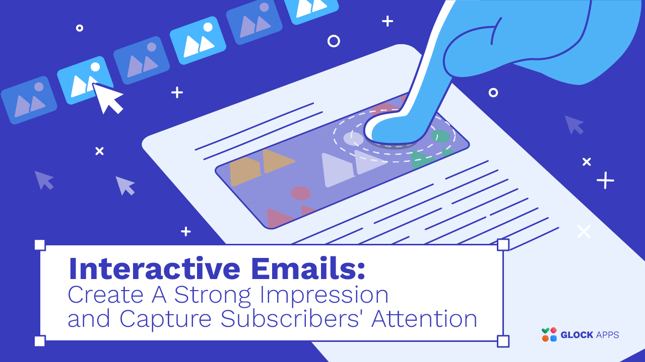
Interactive emails are at the cutting edge of digital marketing innovation. These emails enable recipients to interact with them, and Read more

In today’s overflowing inboxes, a captivating email header can be the difference between a click and a delete. Whether you’re Read more

In today’s competitive marketing field, your email campaigns need more than great copy to stand out. Stunning visuals and smart Read more

What was the last email you received that you remember? Recall what it looked like. Most likely, it had a Read more