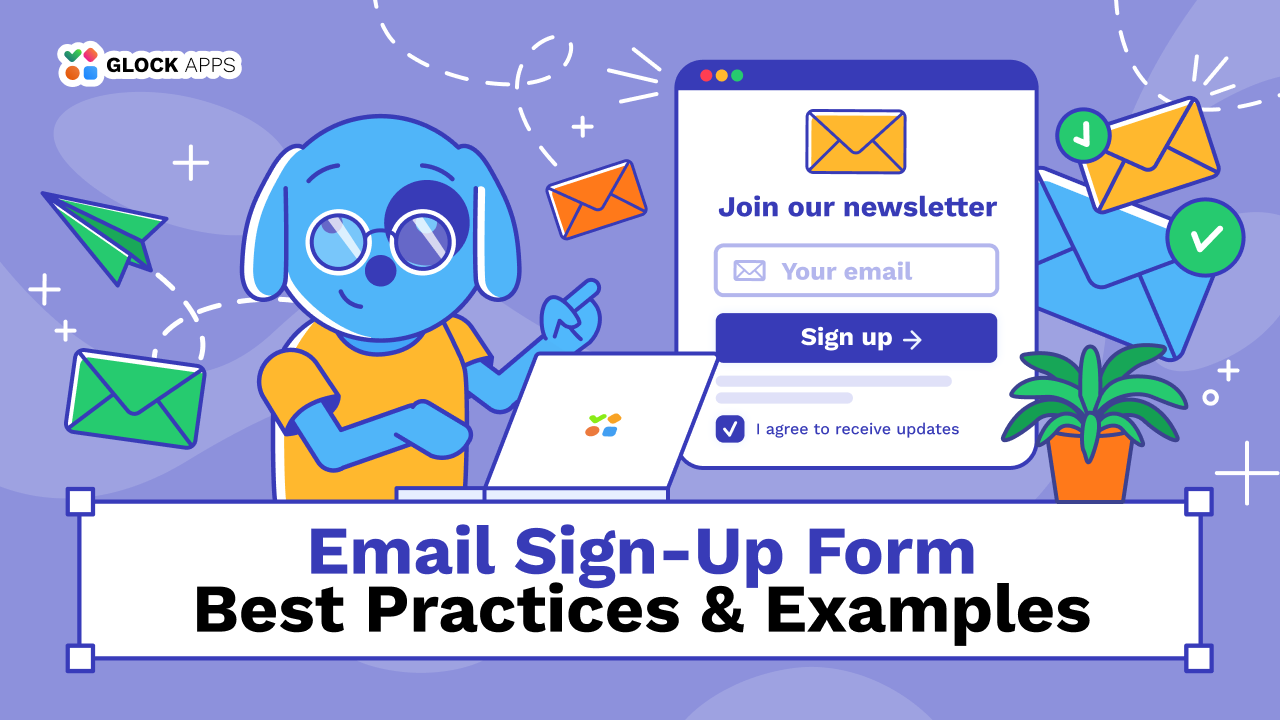
Email Sign-Up Form: Best Practices & Examples
Estimated reading time: 12 minutes
Collecting email addresses through a sign-up form is only the first step in building an engaged email list. Some people might type their email addresses incorrectly, while others opt for a discount but aren’t really interested in hearing from you regularly. If your form doesn’t clearly explain what subscribers can expect, they might forget why they’re receiving your messages. This can confuse and frustrate both sides.
Your sign-up form should attract people who want your emails, set expectations, and give them a reason to stay on your list, not just blindly grow it.
This guide covers sign-up form best practices, with examples and practical tips to improve form design, attract relevant subscribers, and set up a better sign-up experience from the first submission to the welcome email.
Key Takeaways
- Explain what subscribers will receive and how often you’ll email them.
- Keep forms short and easy to complete on mobile devices.
- Match the information you collect to your offer and your lead-generation goals.
- Place forms where the offer is relevant to the visitor’s intent.
- Explain how subscriber information will be used and collect consent where required.
- Test the signup process, including field mapping, confirmation emails, and welcome automations.
- Track subscriber engagement and email performance, not just form submissions.
What Is an Email Sign-Up Form?
An email sign-up form is a website element that allows visitors to provide their email addresses and subscribe to communications from a business, publication, or organization.
Depending on the purpose, a form may collect only an email address or request additional details, such as a name, company, or content preferences.
Email sign-up forms commonly appear in several formats:
- Embedded forms: Placed directly on a webpage, such as a blog post, homepage, or footer.
- Pop-up forms: Displayed in a separate window based on a trigger, such as time on page or a visitor’s action.
- Slide-in forms: Appear from the side or bottom of the screen without taking over the entire page.
- Dedicated subscription pages: Give visitors a separate page to learn about a newsletter or mailing list and subscribe.
When choosing a format, consider what you’re offering and where the visitor will see the form. For example, a newsletter or webinar sign-up at the end of a relevant article would be more appropriate than a pop-up window trying to sell them something with a discount.
Email Sign-Up Forms vs. Lead Generation Forms
An email sign-up form collects email addresses from people who want to receive ongoing communications, such as newsletters, product updates, or promotional emails. Lead generation is a broader process of attracting potential customers, collecting their contact details, and qualifying them to move them through the sales funnel.
An email sign-up form may ask only for an email address, while a lead generation form might request a name, company, job title, or details about the visitor’s needs.
The right fields depend on your goal: an email address may be enough for a newsletter, while additional information can help a sales team assess whether a prospect is a good fit. In either case, collect only the information you’ll actually use.
How To Create a Sign-Up Form That People Finish: 8 Best Practices
1. Make the value of subscribing clear.
Visitors need a reason to share their email addresses. A generic invitation to “Subscribe to our newsletter” tells visitors what to do, but not why they should do it.
Explain what they’ll get and how it will be useful. For example, a B2B software company might offer practical guides, product updates, or advice on solving a specific problem. An online store might send new product announcements and occasional offers.
Compare these examples:
Vague: Subscribe to our newsletter.
More specific: Get practical email marketing tips, deliverability advice, and product updates twice a month.
The second version sets expectations and helps visitors decide whether the content is relevant to them.
You can also offer something in exchange for subscribing:
- A checklist, template, original research, or downloadable guide
- Expert advice and industry updates
- Early access to new content or products
- Exclusive offers or a first-order discount
- Product updates and feature announcements
Choose something you can send regularly to ensure consistent audience engagement.
2. Keep the form short.
Every additional field asks visitors to spend more time and share more information. Before adding another line, ask yourself: What will we do with this information?
Start with the minimum information needed to fulfill the subscription. For a newsletter, an email address may be all you need.
If you want to personalize the welcome email, you could ask for the subscriber’s first name. If you won’t use the information, leave the field out.
If you need several details to qualify a lead, explain why they’re relevant. A longer form is easier to justify when the visitor understands what happens after submission.
3. Make a call to action specific.
The call-to-action (CTA) button should tell visitors what happens when they click it.
“Submit” is functional, but it doesn’t reinforce the value of the offer. A more descriptive CTA can connect the action to the subscriber’s goal.
For example:
| Offer | CTA examples |
| Newsletter | Get email tips, Get the weekly digest, Send me the tips |
| Downloadable guides, checklists, books | Send me the guide, Get my free eBook, Grab the cheat sheet |
| Product updates | Get product updates, Keep me posted, Stay in the loop |
| Exclusive discount | Get my discount, Get free shipping, Get 25% off |
| Templates collection, bundles of several resources | Copy templates, Customize free template, Get my copy, Access the toolkit |
| Webinar registration | Reserve my spot, Save your seat, Join the waitlist |
| Video tutorial or event recording | Watch on-demand, Unlock the masterclass, Get the Recording, Access the tutorial |
The wording should match the action. If visitors must confirm their email address before receiving a resource, explain that in the form or confirmation message.
Make the button easy to identify and tap. Use sufficient contrast, readable text, and enough space around it to distinguish it from other elements.
You can test different CTA labels, but change one element at a time when possible. Otherwise, it becomes harder to determine which change influenced the results.
4. Place the form where visitors are most likely to subscribe.
A form needs to be visible when visitors have a reason to sign up. Its placement can influence the number and relevance of new subscribers.
Consider the context:
- Homepage or hero section: Useful when the subscription offer is a central part of the page.
- Blog posts: Works well when the offer matches the topic of the post.
- Resource pages: Place the form near the guide, report, or other resource being offered.
- Footer: Give visitors a consistent, low-pressure way to subscribe.
- Product pages: Offer relevant updates or promotions when they fit the buying process.
- Dedicated landing pages: Keep the offer and form central when a campaign has one clear goal.
- Checkout or account creation: Include an optional, unchecked checkbox so visitors can subscribe without being enrolled by default.
Avoid placing the form at the top of every page. Instead, test different placements and use website analytics to identify which pages attract visitors who are most likely to become engaged subscribers.
Should you use a pop-up sign-up form?
Pop-ups can make an offer more noticeable, but they can also interrupt browsing.
If you use one, consider displaying it after a visitor has spent some time on the page or scrolled through relevant content.
Make it easy to close, avoid repeatedly showing it to people who have dismissed it, and check that it works on mobile screens. Also test pop-ups against embedded forms or slide-ins.
5. Make the form easy to use on mobile.
A form that looks good on a desktop may be awkward on a phone. Fields can be too small, the CTA can be difficult to tap, or a pop-up can cover the entire screen.
Test the complete subscription process on different screen sizes and browsers.
Check that:
- Fields and buttons are large enough to use comfortably
- Labels and instructions remain readable
- The email field uses an appropriate keyboard on mobile.
- Error messages explain how to correct a problem
- Pop-ups can be dismissed easily
- Confirmation pages work properly on smaller screens
Pay attention to what happens after submission, too. A form that works perfectly but leads to a broken confirmation page still creates a poor experience.
6. Be transparent about consent and privacy.
A sign-up form should make it clear what visitors agree to receive. Don’t hide important details in vague wording or imply that a person must agree to unrelated marketing to access something that doesn’t require it.
The requirements depend on where your subscribers are located and which laws apply. Under the GDPR, when consent is the legal basis for processing, it must be freely given, specific, informed, and unambiguous. Pre-ticked boxes don’t establish valid consent. In the US, CAN-SPAM generally doesn’t require prior consent for commercial email, but senders must provide a way to opt out and honor requests within 10 business days.
Should you use double opt-in?
With single opt-in, a person joins your list after submitting the form. With double opt-in, they must also click a confirmation link sent to their email address.
Double opt-in adds another step, but it filters out typos and addresses entered by someone else, and it provides a record that the person confirmed their subscription. Neither is a legal requirement everywhere, so check the rules for the regions you collect from.
7. Make the form fast and responsive.
A slow-loading page or a form that takes too long to submit can discourage visitors from signing up. Keep the form lightweight, avoid unnecessary scripts, and use browser autofill and clear field validation to make submission easier. Test the form’s loading and submission time on both desktop and mobile, especially if it uses pop-ups or third-party scripts.
8. Make sure the first email delivers.
The first email is part of the signup experience. With double opt-in, it needs to reach subscribers so they can confirm their address. If you offer a guide or other lead magnet by email, your welcome email should deliver what you promised. It can also introduce your brand, explain what subscribers will receive, and offer a useful next step.
Test your welcome email with GlockApps before launch to check where it lands across mailbox providers. You can also schedule Automatic Tests to monitor inbox placement in the background, receive alerts on performance drops, and catch changes early.
How to Create a Sign-Up Form with Your ESP
Many ESPs and email automation platforms, including Mailchimp, Klaviyo, Brevo, and MailerLite, offer built-in tools for creating sign-up forms. Available formats and features vary by platform and plan.
Before publishing, test the full sign-up flow. Submit the form using an email address you control and check that the subscriber appears in the correct list, custom fields store the right information, and any confirmation email arrives as expected. Then verify that the welcome email or automation triggers once, at the right time.
If you offer a lead magnet, check that the download link works and subscribers receive the promised content.
Sign-Up Form Examples Worth Adapting
The best form depends on the offer, the audience, and where visitors encounter it. These examples show how to match the form to its purpose:
Example 1: A Marketing Newsletter
Headline: Smarter marketing, twice a month

Supporting copy: Get practical ideas for improving campaigns, creating better content, and increasing conversions.

Field: Email address

CTA: Get marketing tips
The offer sets clear expectations for content and frequency, helping visitors decide whether the newsletter is relevant to them.
Example 2: A SaaS Resource Download
Headline: Get the SaaS landing page checklist

Supporting copy: Use this checklist to review your landing page copy, messaging, and conversion path before your next launch.

Field: Email address

CTA: Send me the checklist
The offer solves a specific problem for a defined audience. It also fits naturally into a related blog post, resource page, or product marketing campaign.
If you deliver the checklist by email, make that clear. If signing up also means receiving ongoing marketing emails, explain this during the subscription process.
Example 3: A Newsletter Preference Form
Headline: Choose the updates you want to receive

Supporting copy: Select the topics that interest you to get more relevant content from us.

Fields: Email address and optional topic preferences

CTA: Set my preferences
Topic preferences give subscribers more control and help marketers segment their audience. The approach works best when those preferences influence the content people receive.
You can also ask subscribers about their interests after they join your list if extra fields would make the initial form too complicated.
Example 4: A Checkout Marketing Opt-In
Headline: Get product news and special offers

Supporting copy: Receive occasional updates about new products, useful tips, and exclusive promotions.

Field: An optional, unchecked marketing consent box

CTA: Complete purchase
Customers can choose to receive marketing emails without making that choice a condition of purchasing. Keep marketing consent separate from acceptance of purchase terms and follow applicable consent requirements.
These examples are starting points, not guaranteed conversion formulas. Adapt the copy to your actual offer and test how each form performs with your audience.
Conclusion
A sign-up form starts a relationship with a potential customer. Its value comes from whether subscribers receive the content they expected, find it useful, and have a reason to keep opening your emails.
Where the form sits changes who signs up, so placement on your website matters. Try different options and identify engagement trends.
Review results beyond the number of new sign-ups. A form that attracts fewer subscribers may be more valuable if those people engage with your emails and become customers. If many subscribers stop engaging shortly after joining, revisit the offer and the expectations you set when they signed up.
Before launching a new form or changing an existing one, test the entire email flow. Confirm that subscriber details are saved correctly, opt-in emails arrive when expected, and welcome messages or lead magnets reach the inbox. Try using GlockApps to test your deliverability across major mailbox providers and spam filters with 2 free tests from the start.
FAQ
At a minimum, include a clear headline, a brief explanation of what subscribers will receive, an email address field, and a CTA button. Add other fields only when they serve a clear purpose, and provide privacy information or consent options where appropriate.
Consider your homepage, relevant blog posts, resource pages, footer, or a dedicated landing page. Pop-ups and slide-ins are other options. Choose a placement that fits the offer and the visitor’s intent, then compare performance to see which placements attract engaged subscribers.
Not necessarily. Fewer fields can make a form easier to complete, but some offers require additional information. Test form completion alongside subscriber quality and engagement to understand whether the extra fields are worth keeping.
With single opt-in, a person joins your list after submitting the form. Double opt-in requires them to confirm their subscription through an email. Double opt-in can help verify access to an address and reduce unwanted sign-ups, while single opt-in removes the extra step. Choose based on your workflow, list quality goals, and applicable requirements.
A pre-ticked box doesn’t establish valid consent under the GDPR. When consent is the legal basis for processing, subscribers must take an affirmative action. Requirements differ by jurisdiction, so check which rules apply to your audience.
Related Posts
Email marketing success starts with one thing: a healthy, high-quality email list. But what happens when that list becomes contaminated Read more
Even the most carefully written B2B outreach campaign becomes ineffective if emails never reach the inbox. You can have personalized Read more
Not every lead is ready to buy immediately. In fact, most people who join a mailing list are still researching, Read more
When it comes to nurturing your leads and turning them into customers, a lead magnet email sequence is one of Read more