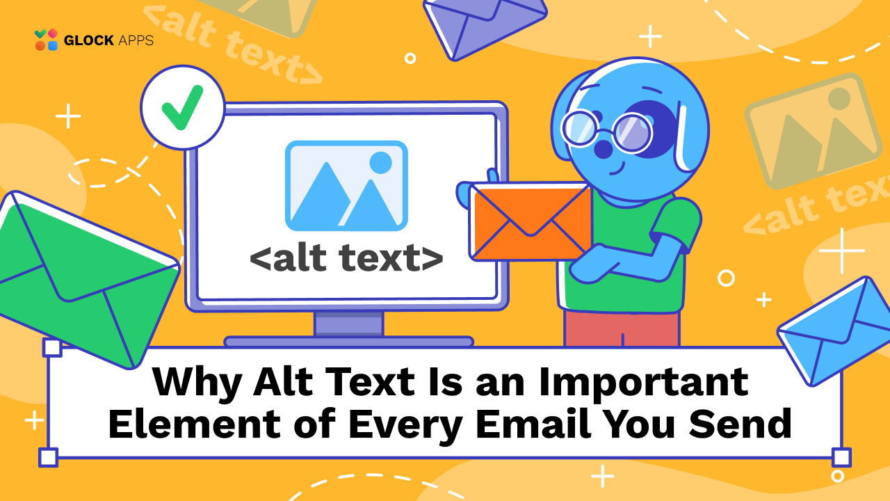
Why Alt Text Is an Important Element of Every Email You Send
Estimated reading time: 6 minutes
Images can be the emotional core of an email campaign. They announce product launches, highlight seasonal promotions, create visual hierarchy, and reinforce your brand identity. But email is not a controlled environment like a website, it’s subject to the behavior of dozens of mailbox providers, device types, privacy features, and user preferences. Your carefully designed images may not load. Your subscribers may have images blocked. And millions of recipients around the world rely on screen readers or adaptive technologies to navigate content. This is why email alt text matters more than most marketers realize.
What Exactly Is Alt Text?
Alt text (short for alternative text) is the written description embedded into an image’s HTML. Its purpose is to convey the essential meaning of the visual.
Technically, it looks simple:
<img src=”header.jpg” alt=”New Winter Collection — 30% Off This Week Only”>
But strategically, it accomplishes much more. Alt text:
1. Creates a fallback when images fail.
Instead of a blank space, users see a meaningful description.
2. Supports screen reader accessibility.
Millions of users depend on alt text to understand the content and intent of an email. For them, alt text is not a “nice-to-have”, it is the content.
3. Reinforces your message across different email clients.
Some clients blur, compress, or block images. Alt text preserves clarity.
4. Helps maintain context across dark mode, high-privacy settings, and low-bandwidth connections.
Not all emails load equally, but alt text makes them usable everywhere.
5. Adds a micro-copy opportunity.
Alt text can gently encourage action, like “View this offer” or “Click to learn more.”
Why Is Alt Text Important in Emails?
1. Images Often Don’t Load, So Alt Text Saves Your Message.
Email marketers frequently assume images will appear exactly as designed. Reality:
- Gmail blocks images for first-time senders
- Outlook may strip or distort them
- Apple Mail’s privacy features can delay loading
- Corporate firewalls block graphics altogether
- Slow mobile networks often prevent image downloads
Add to that users who intentionally disable image loading for privacy or data-saving reasons.
Without alt text, your email loses:
- clarity
- structure
- emotional appeal
- call-to-action visibility
A promotional header reading “50% OFF, TODAY ONLY” becomes nothing more than:
[Image not displayed]
With well-written alt text, the message still delivers:
“50% OFF everything, today only. Click to shop.”
This is why high-performing marketers see alt text as a foundational element of email design.
2. It Improves Accessibility for Millions of Users.
Alt text is a core principle of accessible design. Many rely on:
- screen readers
- voice assistants
- refreshable braille displays
These technologies translate the email into spoken or tactile content.
Without alt text, the screen reader simply says: “Image.”
With meaningful alt text, a visually impaired subscriber receives the same message as everyone else.
This creates:
- equal access
- higher user satisfaction
- stronger trust toward your brand
- compliance with accessibility guidelines (WCAG, EAA, ADA)
It also positions your brand as inclusive, something consumers increasingly expect from modern digital communication.
3. Alt Text Supports Better Email Structure and That Affects Deliverability
While mailbox providers don’t scan alt text for keywords, they do evaluate the overall structure and quality of your HTML. Emails that rely solely on images or lack meaningful supporting text are often considered:
- low-quality
- promotional
- overly commercial
- spam-like
Good alt text helps create a balanced text-to-image ratio and strengthens your email’s semantic clarity.
Use deliverability tools such as GlockApps to check email deliverability, especially if you have been having issues with rendering images. Including alt text doesn’t magically guarantee inbox placement, but it contributes to a better email architecture.
4. Alt Text Drives Higher Click-Through Rates.
When written strategically, alt text becomes a form of micro-copy.
Examples:
Weak alt text:
“Product image”
Strong alt text:
“Discover our new waterproof mascara, smudge-proof for 24 hours”
Weak alt text:
“Button image”
Strong alt text:
“Tap to claim your free trial before midnight”
Good alt text:
- reinforces your CTA
- guides skimmers
- keeps the message alive when images don’t load
- creates curiosity
- encourages interaction even before visuals appear
How Long Should Alt Text Be?
Alt text should be concise but descriptive, ideally within:
80-125 characters
This range is recommended because:
- Screen readers can handle it easily
- The text fits neatly into typical email layouts
- It prevents overwhelming visually impaired users
- It keeps messages scannable
Too short:
“Sale banner” → unhelpful
Too long:
A three-sentence product description → overwhelming
Ideal:
“Black leather backpack, sleek minimal design, now 20% off for members.”
Best Practices for Writing Email Alt Text
1. Be Descriptive, Not Vague.
Write what the user would understand if they saw the image.
2. Communicate purpose, not just appearance.
“What does this image do?” is more important than “What does it look like?”
3. Add CTAs when appropriate.
Especially when the image functions as a button or link.
4. Match tone and brand voice.
If your brand is particularly elegant, minimal, playful, or technical, reflect that here.
6. Use empty alt text for decorative images.
alt=”” tells screen readers to skip irrelevant visuals, reducing noise.
7. Keep accessibility at the center.
Alt text should help readers understand the message effortlessly.
Alt Text & Email Performance
Alt text might seem like a tiny detail, but it influences broader performance metrics.
Better User Experience → Better Engagement
When people understand your email (even without images), they scroll more, click more, and delete less.
Better Engagement → Better Inbox Placement
Mailbox providers reward emails that users interact with positively.
Better Accessibility → Wider Audience
Ignoring accessibility is not just unethical, it’s just bad business.
Better Structure → More Professional Emails
Marketing emails without alt text often look unfinished or sloppy when images fail.
This is why advanced marketers routinely test emails for alt text issues through deliverability tools such as GlockApps, especially when preparing high-volume or revenue-critical campaigns.
GlockApps’ Inbox Insight delivers real-time insights into where your emails land and includes content analysis to assess how your email content (including HTML and image descriptions) may affect deliverability before you send to your full list. Content Analysis evaluates message size, links, and sender reputation, helping you identify weak elements that could hurt your inbox placement.
Conclusion
Alt text may not be flashy, but it is foundational. It ensures your message:
- works everywhere
- reaches everyone
- remains accessible
- keeps clarity even under technical limitations
- supports better deliverability
- drives engagement and conversions
Brands that master alt text are brands that respect their subscribers. Alt text is one of those rare details that elevates your entire email strategy.
FAQ
Alt text provides a textual explanation of images, making emails accessible and coherent when images don’t load.
It improves accessibility, clarifies meaning, enhances engagement, and supports stronger deliverability structures.
Aim for 80-125 characters, which is enough to be descriptive but still concise.
Related Posts

Email marketing remains one of the most powerful tools for business, so it’s important that your emails are accessible to Read more

If your list is growing but revenue isn’t, you don’t need “more emails”; you need smarter email marketing optimization. This Read more

From the moment of its appearance, the email format has evolved from a formal plain text to the whole catalog Read more
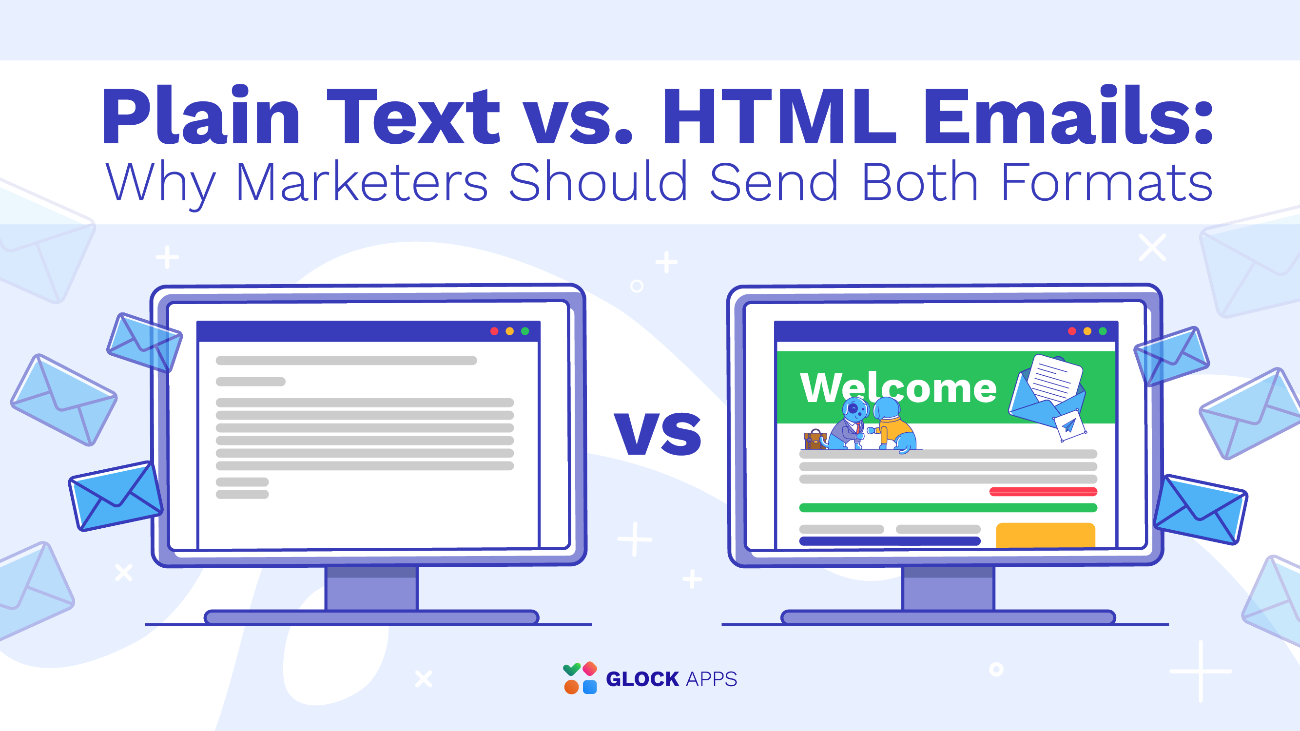
You may have heard a lot about the revival of plain text emails these days. In an era when email Read more