Blog
Best Email Marketing Tools for B2B Companies: Automation, Deliverability & CRM
 Written by Tanya Tarasenko
Email marketing continues to be one of the most reliable communication channels in the B2B environment. Despite the rise of social media and messaging platforms, email remains the backbone of lead nurturing, product announcements, onboarding campaigns, and long-term customer engagement.
Subscription Renewal Email: Best Practices to Keep Customers and Revenue Flowing
Written by Tanya Tarasenko

For subscription-based businesses, renewals are just as important as acquiring new customers. Every expiring plan represents a moment of decision: will the user continue the relationship with your brand, or quietly churn?
Best Budget Email Marketing Tools for Growing and Small Businesses
Written by Tanya Tarasenko
Choosing the right email marketing software can be surprisingly difficult, especially when you’re trying to balance features, pricing, and long-term scalability. From my experience, one thing is clear: the most expensive tools aren’t always the best choice.
Email Sandboxing Explained: How It Protects Your Inbox from Malware and Phishing
Written by Tanya Tarasenko
Every day, organizations receive thousands of emails containing attachments, links, and embedded scripts. While most of them are harmless, some hide sophisticated malware designed to bypass traditional security filters. Over the years working in email deliverability, I’ve noticed that standard spam filters alone are no longer enough to stop advanced threats. Attackers continuously evolve their techniques, creating malicious files that look legitimate and evade conventional detection.
Is Your Domain Listed on SURBL? Here’s How to Remove It
Written by Tanya Tarasenko
If you work in email marketing or manage outbound infrastructure, sooner or later you’ll run into a blacklist issue. One name that often raises questions is SURBL.
Over the years, I’ve seen how confusion around SURBL leads to panic: “My IP is blacklisted!” In reality, SURBL works a bit differently than many traditional DNSBLs. In this article, we’ll talk about what SURBL actually is, how it works, how to check whether you’re affected, and how to fix the issue in four clear steps.
Return Path Email Header Explained
 Written by Julia G
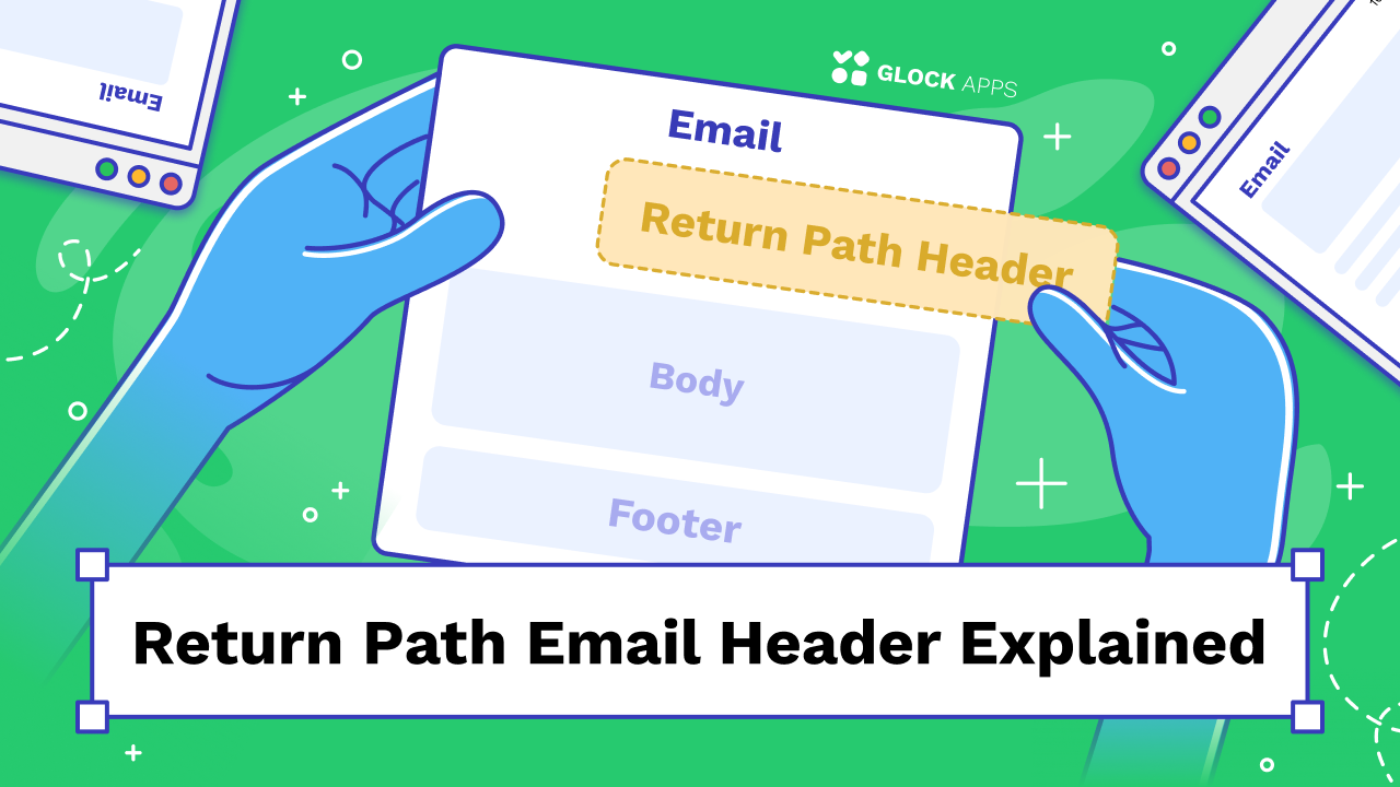
When a recipient’s mail server rejects an inbound email, where does that message go? Does it just disappear or does it go back to the sender?
HTML Email Best Practices: Design, Code, and Deliverability
Written by Tanya Tarasenko
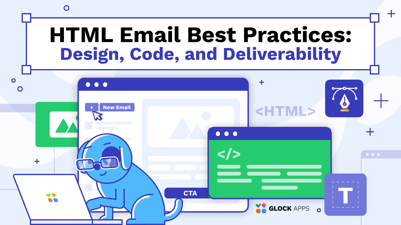
HTML emails can be powerful, visually engaging, interactive, and conversion-driven. But they can also break, land in spam, or render inconsistently if built carelessly. After years of working with email marketers, developers, and deliverability teams, I’ve seen one consistent pattern: beautiful design means nothing if the email doesn’t reach the inbox or render correctly.
AI Summaries in Email: Strategies for Gmail and Apple Mail
Written by Tanya Tarasenko
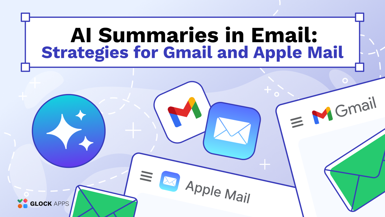
Over the past year, I’ve watched inbox experiences change more dramatically than at any point in the last decade. What used to be a competition between subject lines and preheaders has evolved into something more complex: AI-generated summaries that shape what subscribers see before (and even after) opening an email.
What Is Targeted Email Marketing? A Guide for Email Marketers
Written by Tanya Tarasenko
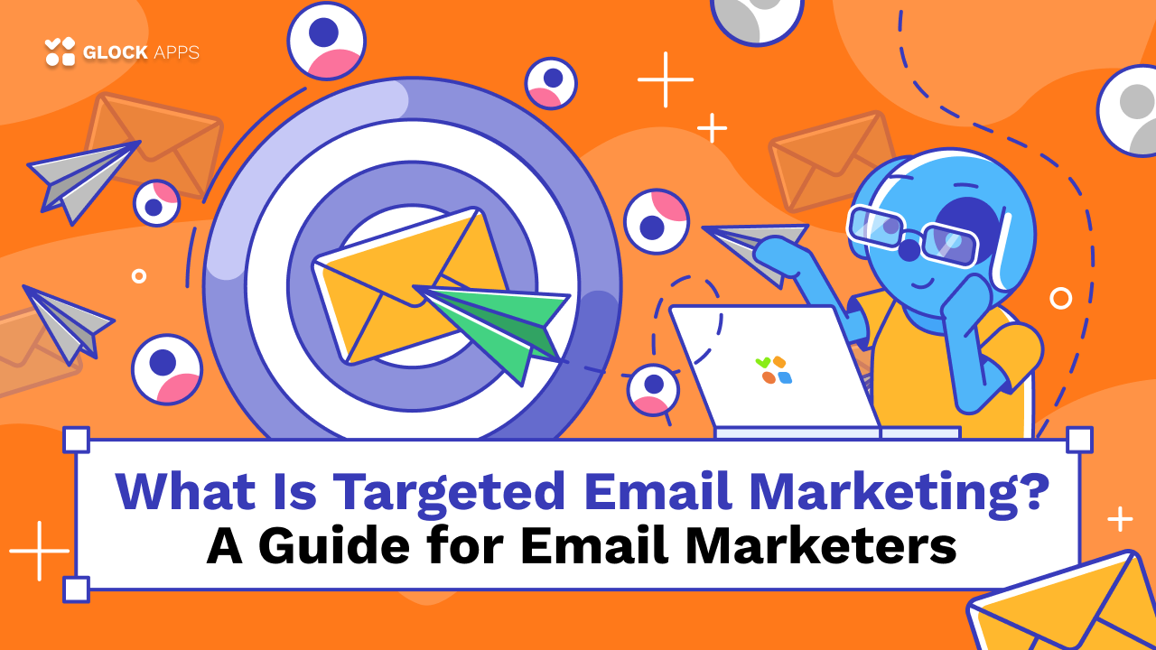
Targeted email marketing is no longer a “nice-to-have” tactic, it’s the foundation of modern lifecycle communication. Over the years, I’ve noticed that the campaigns delivering the highest engagement rarely rely on clever subject lines alone. They succeed because the message, timing, and audience alignment feel intentional.
How to Send Mass Email in Outlook: A Practical Step-by-Step Guide
Written by Tanya Tarasenko
Email remains one of the most effective communication channels for announcements, newsletters, internal updates, and client outreach. Yet many people still struggle with how to send mass email in Outlook without creating spammy experiences, exposing recipient addresses, or damaging deliverability.